For this section, it was this piece;
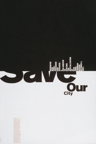
Michael Bierut, Save our City
I've always been fascinated with this kind of work, using powerful black and white in interesting ways.
When pieces use negative space interchangeably as the positive space, it isn't only visually pleasing, but it makes me think to myself that I couldn't have thought of that.
I like them simply because they are so clever. In this piece, I like the weight of the black square pushing down on the "Save our City" text and I like the cityscape made of text.
-Thomas Holland
Beautiful piece.
ReplyDelete