In this section the book discusses advertisements, consumerism and
What I find most interesting is the complexities of advertisement.
Not only do they need to avoid any politically sensitive topics and angering certain groups of society, but they also have to become more and more complex to keep interest.
The book likens this to having to battle for a consumers attention because they're always about to fast forward their TiVo, change the channel, or go to another website.
The result of how hard advertisers are trying to maintain the focus of the consumer is both good and bad for the consumer.
It's good because the consumer then is growing smarter, realizing that an air freshener is not going to make a family happy, fulfilled and loving. Compared with the typical image of the masses as a mindless flock that'll buy up anything thrown at them, this is quite a good thing.
The flip side of that though, is that advertisers have to delve deeper into what people want from life, just to sell some soap or laundry detergent. This makes the advertisements stronger, almost making them into something more than an advertisement (Perhaps more like a social statement of what people find important).
The entire idea of advertisers having to come up with new and innovative ways to present the same products also touches on the general issue of society's members becoming more and more caluse through the mass production of. products and services.
Interesting stuff.
-Thomas Holland
Monday, September 30, 2013
DTC 355 123-135 Stewart
From this section, I especially liked the Adam Kallish interview where he discussed Design Methods.
The diagram on page 127 illustrating the Design Method made a lot of sense to me.
It looks complicated, but as I read across the diagram it became clear that the process makes the initial thought process more complicated, but makes a more rewarding design in the end.
You could just jump into the design and roll with something you brainstormed.
But with this method, by the time you have an idea to present as an option to somebody, you've already thought through the implications it could have.
I can see how this process, if practiced enough, could be extremely helpful in coming up with designs that will jump through the political hoops of today's media.
-Thomas Holland
Thursday, September 26, 2013
DTC 356 POL 223-260
What this section makes me think about is the power that the video recording and images of the 9/11 attacks had on the American people.
With this event, as the book said, the terrorists got their desired affect. It wasn't about the buildings themselves, but the spectacle of it.
But this video also was able to stir the country into accepting far more radical and violent Anti-Terrorist policies to hold the people responsible for their horrendous actions. In the context of the book, this acceptance isn't just because of a political reality (people willing to act stronger immediately after something stirring) but rather an explanation and example of the sheer power a video can have on the public.
-Thomas Holland
DTC 355 Vector TripTyc
"Also Number 1"
The title is a play on Jackson Pollock's "Number 1", just a comment on his style in general.
The idea behind this piece is How it is easier to love than hate, but in the end those two emotions are strongest together. Nothing inspires hate like love, and nothing intensifies love like hatred of other things. It is vertical for the downward motion of this, hate being at the top, love in the middle, and a mash of the two together in the bottom. They have to exist together.
Monday, September 23, 2013
DTC 356 POL 200-220
I think that Copyright, while it gives me an unhappy feeling, can also go a long way to speak of the changing meaning of images.
I mean as the book explains more of the problems that the law encounters involving intellectual property and ownership, the history of Copyright law is inadvertently giving a live commentary to how people view images and their contextual meaning of the time.
For instance, the copyright issues involving Korda's photograph of Che Guevara only came about because of the cultural meaning the image was given. As time went on, the meaning of the image has been enhanced and changed into something that Korda isn't in control of.
Otto Wacker's forgeries of Van Gogh paintings on the other hand, in its copyright case, spoke about the value of the idea of paintings as well as the physical presence of paintings. Moving to Lugosi Dracula, an idea spun around an individual and created a new image to represent an old tale.
So while each of these instances involved a mess of legal issues, these issues arose because of the way that images change meaning and how they truly can take on a life of their own.
Copyright law ends up chronicling instances where the meaning and use of images are changed in new ways and can speak volumes about the cultural value of these images.
Confusing, but in a way an entertaining attempt to keep a lid on the use of images.
-Thomas Holland
DTC 355 Stewart 111-123
The differences of divergent and convergent thinking interested me the most in this section.
For the most part I think I work with rational and linear thought processes when designing my pieces. This would put me on the path of convergent thinking.
Divergent is more along the lines of the elusive way of just "coming up" with ideas that I tend to not fair well with.
I do like the idea of forcing yourself to pick seemingly unrelated things under a broad concept and then create a piece from the resulting chaos. This would force creativity and a unique perspective out of anybody should they choose to do the process in earnest.
I also like figure 5.15 on page 122 where Keith Smith has an exert where he chronicles his verbal connections to a strange conclusion. This is also a nice way to end up with some creativity, if you have the mind to keep the brainstorm rolling. I feel like if you stopped for a moment to think about your next sentence, you'd lose the essence of the brainstorm.
-Thomas Holland
Thursday, September 19, 2013
Wednesday, September 18, 2013
DTC 356 183-200
The value of originals is interesting to me in this section, as the availability of reproduction affects this.
The book says that, "Value is a key factor in the status of reproduction, originals, and copies."
It makes me think of digital art and photography, and their potential to be infinitely copied and each be identical to the original.
As I enjoy making Digital art, it makes me think of the value of what I'm producing.
The book covers that a limited quantity is the way to make the work more valuable, and I would think a digital artist who wishes to sell his work would be well advised to print off a certain number, and keep the image off the web.
In that way, while there could have been many, there simply are only a few.
Through limited reproduction, the value would be maintained, because art should never become worthless.
-Thomas Holland
DTC 355 98-111
It is interesting to me to look at perspective in Animation, because my interest in design came from that.
When people watch animated films, they tend to be oppressed by the stigma of being childish.
In fairness, plenty are meant for children, and cartoons saturate the animation market with youth-centered animation.
It's because of that focus that some people can be distracted by the monumental achievement and beauty of these films. What animation often lacks in realism in characters faces, is more than made up for by sheer volume of images and painstaking backgrounds.
Hayao Miyazaki comes to mind, an animator, designer, and director of animated movies. In his works some of the most beautifully rendered backgrounds and scenes come to life.
It is a shame that some of the talent involved in Animation is overlooked by the art world, because it is as impressive of a creative endeavor as any other, yet doesn't receive the same praise.
-Thomas Holland
Monday, September 16, 2013
DTC 356 Lessig 53-79
Copyright is a frustrating thing to learn about, as I found out about a year ago when I watched a two hour presentation on Copyright laws.
That one in particular was at an Anime convention, and explained that everybody dressed up as a character is technically breaking a law (it did note the value of such things, through free advertising though).
It seems to be good at first, the law protects individuals who create something. But the gritty part of it comes in where things seemingly unrelated are then either violations or things that require payment to the owner.
Tinkering was brought up in this section, with the example of previous generations tinkering. Then there was physical tinkering, whereas people of this generation are more digital, tinkering digitally.
It's interesting and sad to read the example of a college student being sued for tinkering, and makes me think about how the ability to mess around and play are increasingly viewed as "criminal" despite their pure intentions.
As the text continues to prove, tinkering can create fantastic things. Great inventions come from play, yet play is being viewed as a violation of some law.
Personally, It seems flat out wrong for a person to need to learn the ins and outs of the Copyright and legal world just to be able to see what happens when you mess with something.
-Thomas Holland
DTC 355 Stewart 81-95
I like to point out one thing in particular from each of the readings that stands out to me, mostly because in honesty the one thing that will stick, or that is remembered best, is that which stands out to you.
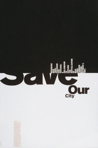
For this section, it was this piece;
Michael Bierut, Save our City
I've always been fascinated with this kind of work, using powerful black and white in interesting ways.
When pieces use negative space interchangeably as the positive space, it isn't only visually pleasing, but it makes me think to myself that I couldn't have thought of that.
I like them simply because they are so clever. In this piece, I like the weight of the black square pushing down on the "Save our City" text and I like the cityscape made of text.
-Thomas Holland
Data Visualization - Thoughts
When I thought of Data Visualization, I had some simple graphs in mind.
I know that data is constantly being compiled into varied representations, but didn't think of it as a terribly innovative area.
After looking around at some examples, I think I've changed my mind.
The work can be very creative, with subtle details in the visual representation having a meaning that coincides with the data itself.
For instance, I was inspired by this Visualization in particular;

It's a Graph involving data about nature. What I love is the surreal plant-like vibe it gives off, the lines themselves feel organic and add to the data itself.
Even stranger is that some of these Visualizations are more like art than data!
Here's the link where I found this image, as well as other great examples;
http://www.webdesignerdepot.com/2009/06/50-great-examples-of-data-visualization/
-Thomas Holland
I know that data is constantly being compiled into varied representations, but didn't think of it as a terribly innovative area.
After looking around at some examples, I think I've changed my mind.
The work can be very creative, with subtle details in the visual representation having a meaning that coincides with the data itself.
For instance, I was inspired by this Visualization in particular;
It's a Graph involving data about nature. What I love is the surreal plant-like vibe it gives off, the lines themselves feel organic and add to the data itself.
Even stranger is that some of these Visualizations are more like art than data!
Here's the link where I found this image, as well as other great examples;
http://www.webdesignerdepot.com/2009/06/50-great-examples-of-data-visualization/
-Thomas Holland
Friday, September 13, 2013
The Ambition of Artists
I came across this poll today on Deviantart, and it made me think a bit.
As an artist, you can choose to represent anything, create anything.
Yet most people don't like to do things they aren't comfortable with.
It's understandable, and I myself for a long time have done the same.
I still stray from things I'm bad at, and try and use techniques and elements I am familiar with.
It's just strange to think that the only thing that holds people back from creating their wildest imaginations on a canvas is more or less fear and a comfort zone.
I wonder what the art world would look like if every artist lived up to their imaginations and went for it, even if it's vastly beyond their capabilities.
Most people here said "3", but that says they are "kinda ambitious".
That pretty much says they're probably creating in their comfort zones for the most part, something I wish all artists could break out of.

-Thomas Holland
Storyboard DTC 356
This is the storyboard I did, and I thought it should go on here!
-Thomas Holland
Tuesday, September 10, 2013
DTC 355 Stewart 66-81
The most interesting thing for me in this section was Radial Symmetry.
I've read other books covering Symmetry and Asymmetric, but I don't recall hearing the term Radial Symmetry.
As it sounds, it radiates from the center of the image and is an image where the lines and shapes are mirrored both vertically and horizontally with the center of the composition as a focal point.
I went and found a few images to illustrate this point.


-Thomas Holland
I've read other books covering Symmetry and Asymmetric, but I don't recall hearing the term Radial Symmetry.
As it sounds, it radiates from the center of the image and is an image where the lines and shapes are mirrored both vertically and horizontally with the center of the composition as a focal point.
I went and found a few images to illustrate this point.
-Thomas Holland
Friday, September 6, 2013
DTC 356 POL 42-62
One part of this reading that I enjoyed was the lava lamp.
Hearing how it went in and out of style several times, and that it was originally unpopular seems amusing to me.
I always assumed the lamp was a bi-product of the 60s, created by somebody who wanted to stimulate psychedelic situations.
To think it was considered ugly from the time it was actually made is pretty funny.
Similarly, the lava lamp follows a discussion about "kitsch" art.
I can see the reasoning in Clement Greenberg's criticism of kitsch works, because all around us are cheap replications famous artwork, or sloppily designed and mass produced pieces.
What comes to mind for me is the back of Ross or T.J. Max, where they have clumps of cheap artistic decorations.
There is nothing wrong with these decorations (aside from feeling as cheap as they actually are), but I can see how from an artistic viewpoint that that kind of kitsch work and reproduction further deteriorates the value of real art pieces.
As we live in a culture that values appearances of our possessions and home as a representation of ourselves, everyone decorates in some way. These cheap decorations make this goal achievable, and satisfy the demand.
But as a aftermath, I wonder how this affects how people view art and the value of it. I imagine it lowers the general public's view of art's value, with thoughts such as;
"Well it looks nice, but I don't see how it's worth 5 grand when I have something similar for $15."
While the originality of a piece, as well as it being the only one, adds immense worth in the art community, I fear the general public doesn't see the value of the original over the reproduction (and will see it less with the continued flooding of cheap art in stores and homes).
-Thomas Holland
DTC 355 Stewart 54-66
A section on the importance of color and how it can aid composition, which is pretty general information.
What I did like though was the artwork on page 59 entitled "Radioactive Cats".
The color usage is blaring against the cold grays and add a creepy feeling to the cats.
The quantity of cats also adds to the unsettling feeling, but the characters in the artwork don't seem to be bothered at all by it.
To me, they look like clay, and I'm a fan of claymation work.
-Thomas Holland
Tuesday, September 3, 2013
DTC 356 Lessig 15-30
As I read, I increasingly want the author to be clear.
He says himself that he isn't trying to be mysterious, but simply mapping out his book and points before delving into it.
However, as far as I've read, he hasn't clearly stated the problem.
This detrimental problem that he is doing so well at presenting as ominous and horrible, has not been stated.
He says it is between "property" and "piracy", so I can understand/assume some of his argument to be about the copyright and "property" laws making the everyday citizen increasingly needed to be "approved" to use certain images and say certain things due to the exponentially growing trademarks and things that are "owned".
I would quite appreciate if he would state his message clearly though, as a reader it feels like I'm being strung along to lead up to some big reveal of his real point.
-Thomas Holland
DTC 355 Stewart 38-54
Color is one of the most important things in our society
But also the most commonly overlooked parts.
In a typical day we don't think about the symbolism of colors that tell us to stop, go, be happy or feel sad.
It is in art that some of this lack of attention to the colors around us is undone.
When people look at art, they examine the colors with meaning to draw more from the work.
All of a sudden these things we become so oblivious to usually are in the front of our mind, giving weight to a piece to provide a sense of balance (or lack there of).
What I find most interesting are color combinations such as complimentary or split complimentary.
They seem somewhat strange to me, to why these colors work so well together just because in a circle they lay across of each other.
Color is an amazing thing and it is a shame that it has to be used in art to be noticed, when art draws these colors from the world around us.
-Thomas Holland
DTC 355 Self Portrait
-Thomas Holland
Monday, September 2, 2013
Free Culture Prologue (DTC 356)
In this prologue, the author describes situation in which the culture we live in is invariably being affected by the Internet.
Like it or not, use it or not, the internet is affecting our daily lives.
I personally agree with this, because in recent years, and likely more so in future years, things are becoming more and more online.
As business leans towards online features and services, it becomes harder to stay offline.
I don't doubt that in the future, we could find ourselves unable to operate in society without being online.
The author then turns to say that our creativity itself is being controlled, and through this creativity, our culture is not as free as it should be.
He says he stands for the balance between control and anarchy, but doesn't want either of them.
That idealism, before the book gets too technical, is simple and easy to agree with.
Anybody who creates wants their work to be protected, but not restricted.
-Thomas Holland
Subscribe to:
Posts (Atom)